

Branding
Meet our brand
Wordmark
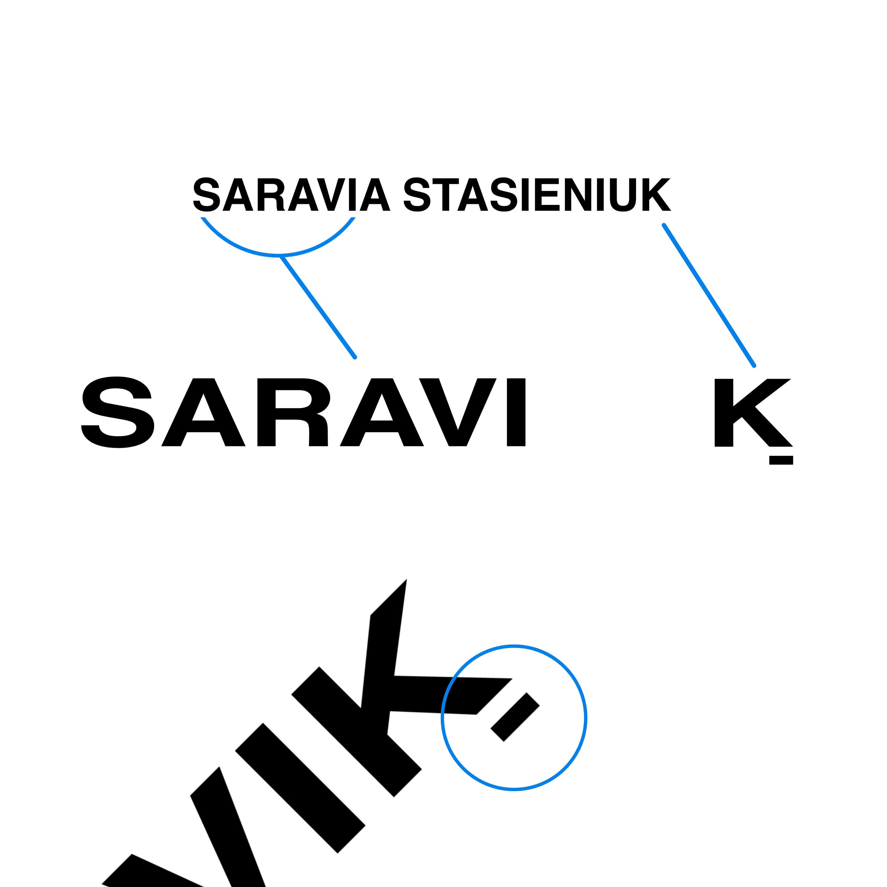
The name
SARAVIK originates from Santiago Saravia Stasieniuk, a blend of his family heritage. "SARAVI" reflects his father’s Uruguayan roots, while "K" honors his mother’s Polish lineage. SARAVIK goes beyond family names—it's about our commitment to a purpose-driven life..
The typeface
At SARAVIK , Helvetica is more than just a font—it’s a statement. Known for its clean, modern, and timeless design, Helvetica embodies the elegance and simplicity that defines our brand. Naturally, it’s part of our logo.
The rectangle
The rectangle in our design represents trust, functionality, and harmony.
SARAVIK'S
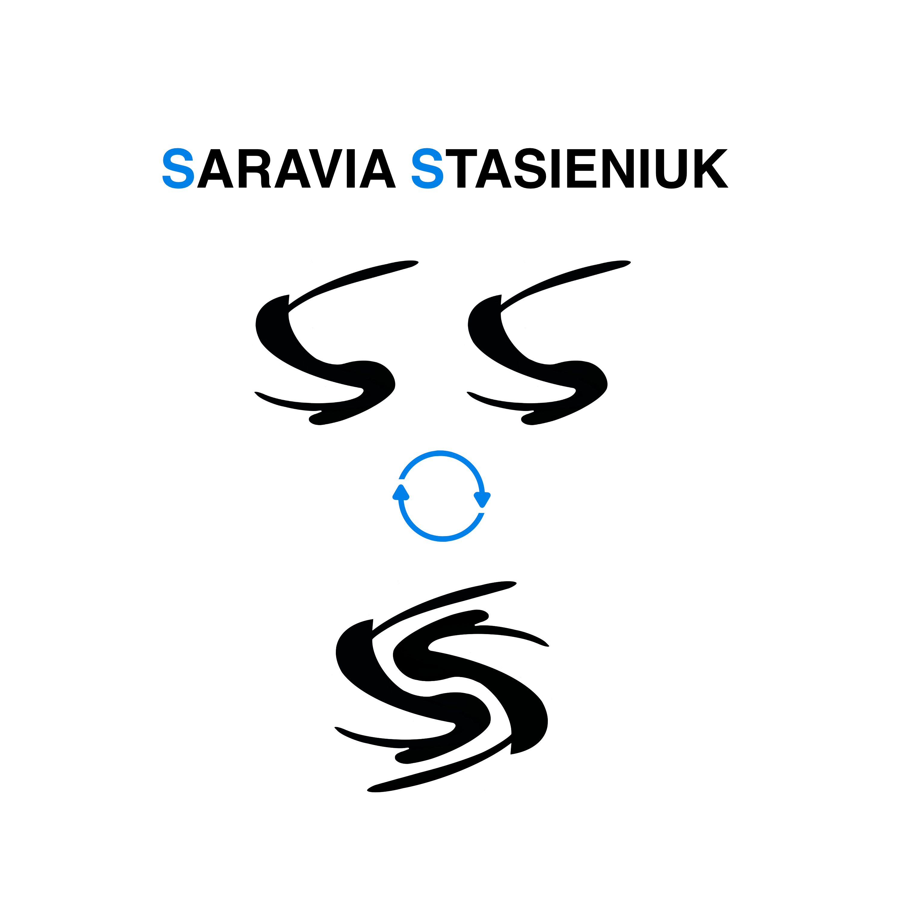
Monogram
SARAVIK combines creativity with family heritage. The original logo used one S, but it felt incomplete. We updated it with two S letters, one upright and one flipped, to create balance and symmetry.
The two S letters come from the names Saravia and Stasieniuk. The design is simple, but it says a lot. It reflects the brand’s identity. It is clear, bold, and built with purpose.

SARAVIK'S
Color
Picking the right color wasn’t easy. We didn’t want something that just looked cool. We needed a color that matched our vision.
Blue stood out. It shows confidence, logic, and clear thinking. It also stands for freedom, like the sky and sea.
We chose a lighter shade to keep it fresh and modern. It represents our brand's identity; you will find it as details all around SARAVIK
More stories
Explore SARAVIK to its fullest
Subheading